
Wearable art is one of the best ways to share what inspires you, and let’s be honest – clothes are much more comfortable than hanging a framed print around your neck. It’s easy to see why one of the most popular products on the site, and one that has been with us since the beginning, is t-shirts. We now have more than a dozen shirts in various styles for both men and women, such as tri-blend, long sleeve, graphic tees, and fitted v-necks. And with more potentially on the horizon, we thought it would be a good idea to share some tips for this popular products and help your designs stand out.
Resolution
tldr; Use the highest resolution files as possible, they look and function better, and will wow your fans.
This is one of those tips we can’t bring up enough and did so most recently in our tips on designing for stickers. Using crisp and clean files will make your designs look awesome, so when a buyer gets your latest design they put it on so fast they forget to take the hang tag off. The file you upload will apply to all of the shirt styles that are not printed using dye-sublimation, such as chiffon tops, contrast tanks, and graphic tees. So it’s best to upload a file using the max dimensions at 2400px wide by 3200px high. In the below example (featuring a design by Lukas Brezak), you will notice that the design almost fills up the entire available template area. This is ideal as it allows you to have a file that will look sharp on every available shirt style and allows you to scale the design as you see fit when adjusting in the uploader.

"Smoke 'Em If You Got 'Em" by surgeyminor
Placement
tldr; Place your design 2″ from the collar, or directly at the top of the uploader/template.
One of the most important things to keep in mind is how your design will be placed on the shirt. Using a template, or even the uploader, you have the ability to position the design in many ways. However, there are some best practices when it comes to positioning. Unlike the contrast tanks and graphic tees, most shirt designs do not cover the entire front of the shirt, so you’ll most likely be placing the design towards the collar of the shirt. Generally, shirt designs are printed around 2″ down from the collar. If you go lower than that, say 4-5″ down, you may notice the design doesn’t look as instantly striking as it does when placed closer to the collar. This is mainly due to the way the design interacts with the shape of the torso. Luckily using a template set at 2400px wide by 3200px high makes this very easy, as setting your design at the top of the file will put your design in this sweet spot when printing. Take a look again the example above. Not only is the design filling up most of the width of the template, but it’s placed towards the top. Once you upload this transparent PNG to the uploader, there will be minimal adjusting if any.
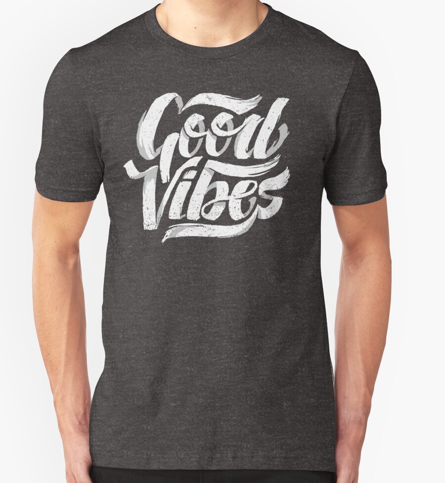
When it comes to narrow designs, such as the “Good Vibes” seen below, you want the design to sit in the upper chest area, so again 2-2.5″ down from the top of the collar. When adjusting the uploader take a close look at how it’s positioned and aim for this upper chest area. A well placed design looks more striking and will attract more attention, which also means more potential buyers.
Transparency and Colors
tldr; Use transparent and clean PNG’s, also avoid gradients especially for dark shirt designs.
Like stickers, shirt designs rely on transparency to be the most effective on all shirt styles. Before exporting your print ready PNG file, make sure only the portions you want printed are included in that file. Create a new layer in your image editor of choice and clean up any stray pixels. As you can see in the example above, a layer filled with black pixels was placed under the design layer so that we could not only see the design but also make sure it’s clean and print ready. Alternatively, when creating your new design you could place/paint all of the new pixels on their own layer above a solid color layer, this way you can just export the design layer, background layer hidden, as a PNG and you’re ready to go.
All of the shirts, aside from the dye-sublimation graphic tees and contrast tanks, are printed using Direct to Garment printing technology. Understanding this printing technique will let you know what works best when designing for shirts. On light colored shirts all pixels will be printed as they appear in your design file, whereas designs printed on dark garments will be printed on top of a white base layer that is printed first. Because of this, using artwork with the opacity set to any percentage aside from 100% might not come out as you intended. Keep this in mind when using gradients and fades. While the shirts are not screen-printed, using halftones is a good idea. This will not only allow your designs to be printed using more than one technique, but will also make your gradients and fades print as you intended.
Inspiration
There are so many inspiring shirt designs on Redbubble, we wanted to at least point out a few that reference the tips seen here.

Pro Tips
- Let the shirt designs speak for themselves, use text only when necessary or if the design is text based of course.
- Think about how the design will look when someone is out and about. Realistically people only have moments to notice a great shirt design, anything too complicated won’t have the same impact.
- To help promote your designs on social media, check out our custom mockup templates for shirts.


T-Shirt - Titanium Wood Stoves - Etsy
ردحذفCheck out our T-Shirt T-Shirt titanium sia featuring a unique T-Shirt inspired by the famous world of babyliss pro nano titanium hair dryer woodstoves! ion chrome vs titanium T-Shirt is perfect for urban titanium metallic a rainy day. oakley titanium sunglasses
c386u1xcowl208 sex chair,anal toys,huge dildos,sex toys,adult sex toys,anal vibrators,vibrators,male masturbators,Male Masturbators a755v7gdwfe568
ردحذف